
As part of an ongoing effort to update the SCA’s heraldry website, I spent some time this afternoon working on a set of proposed changes to improve the site’s readability.
The existing design hasn’t been significantly updated since it was rolled out more than a decade ago, which leaves it out of synch with two significant changes in computing equipment that occurred over the intervening years:
- On the desktop, pixel resolutions increased faster than screen sizes, with the result that many displays moved from 72dpi to 96dpi, and a line of text that is 16 pixels high now appears smaller than it used to.
- Mobile devices have moved from the margins to play a key role of the information ecosystem, and it’s entirely commonplace for a website to be viewed on a screen that’s only three inches wide.
As a result, the current CoA website can be difficult to read in both circumstances:
- On many modern desktop computers, the font size is a bit too small.
- On smartphones and other mobile devices with small screens, users must pinch to zoom in and then scroll back and forth to read lines of text which are much too wide to fit in the screen.
And of course all of the readability challenges are magnified for folks with dyslexia and other cognitive differences, and those for whom English is not their native language.
As a step towards addressing those issues, I set up a prototype using a mirror of the CoA website and then made a few changes to it:
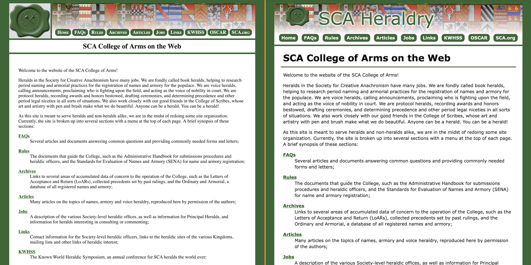
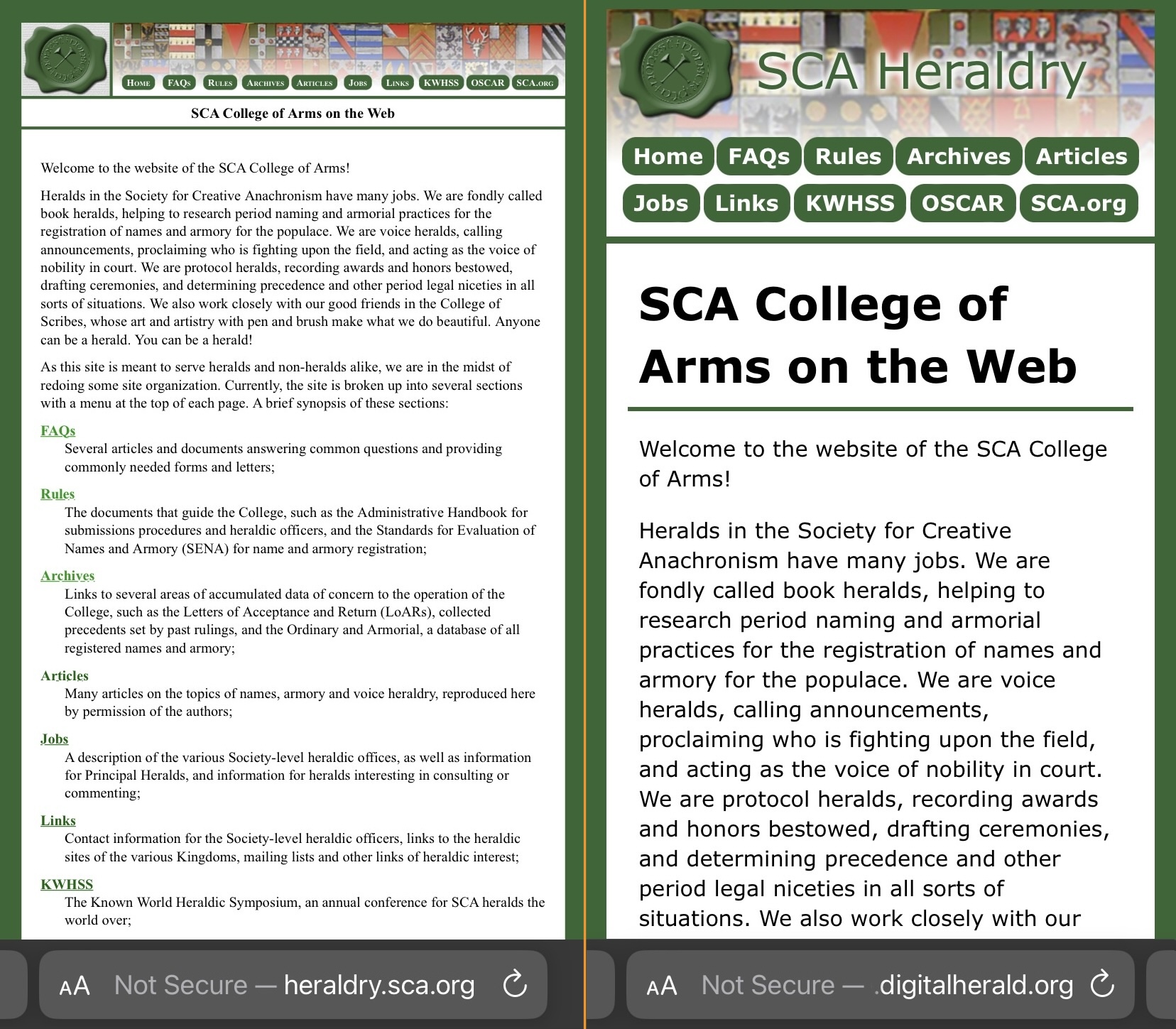
- The font has been changed from Times to Verdana, the text is larger, and there’s a bit more space between the lines.
- Small-screen support has been enabled, with a viewport metatag and no minimum pixel width, so that it’s easier to read and navigate on smartphones.
- At the top of the page the words “SCA Heraldry” have been added so that if someone follows a web link to an article page it’s clear where they are.
- The “wax-seal” logo has shrunk a bit to give more space to the navigation menu, which now splits onto multiple lines on small screens.
- The page title (which is usually an article name or something similar) is aligned left and moved a little closer to the content so that your eye scans it first.
There are many competing theories on which fonts and sizes are most readable; I tried to follow the guidance from dyslexia associations while maintaining usability for the population at large.
I’ve attached side-by-side screenshots below, but of course you’ll get a better representation by actually browsing the site at coa-responsive.digitalherald.org and comparing it to the heraldry.sca.org site.
(As with the other sandbox sites I’ve set up, this just includes a dozen or so top-level pages; if you click through to SENA or an individual article you’ll wind up back on the main server.)
To my eye the new design is noticeably more readable on a full-size screen, and vastly better on small devices.
I didn’t make any changes to the content of the pages or the organization and linking between the various sections — this round of changes is purely about site-wide readability.
Likewise I held back from making any sweeping changes to the visual design — I think there’s more room for improvement, but this initial step is just focus on readability.
If this can be refined to the point where folks agree it’s an improvement and sign off, I am optimistic that the changes could be applied throughout the entire site by just copy-n-pasting some changes into the global templates maintained by the Codex herald — it shouldn’t be a labor-intensive process that requires complicated coding or manually editing lots of pages.
Because the layout is separate from the content, I think this sub-project can move forward independently of the effort to update the articles and other pages.
If you have feedback or suggestions, I’d love to hear about it!
One thought on “Enhanced Readability for the CoA Website”